Week12
Good Design:
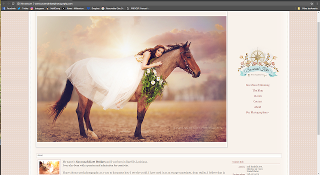
Here we have a photography website. I was searching through them to chose one for myself. This website is extremely user friendly. You immediately greeted with her work and her bio. Its bright, airy and has a refreshing layout. Everything you need is there on the right and easy to understand. Through out the website the feel is kept the same and you can tell what her company identity is. I personally was looking for pricing on weddings and I found it almost immediately. I unfortunately found she was out of my price range but kept reading her policy because of how inviting her site is. I happily found out that she offers a payment plan and might actually be able to book her. If her site wasn't so inviting i may have missed that and moved on. (On a side note after talking to her. She is super sweet and if you are ever looking for a photographer she is your girl!)
Bad Design:
Alright so here we have a pretty simple website for a photographer. I was looking around for a wedding photographer and found this one. Its hard to tell but her photo name is H Rosario Photography, the link is provided below. I found her through Facebook and loved her work so i decided to take a look at her prices and booking. Right off the bat your hit with hard to read font. The colors all mash together and all you can really tell is that there is a photo and what might me writing to the right of it. It could be great the simplicity is nice. However, the simple wrong decision in background and font color really put someone off. I decided to see how her prices were though. That was when i was hit with hidden information. You go to booking and its more of a contact sheet where you fill it out and then she will contact you. I understand why but when I'm this early into researching I don't want to waist her time or y own just to find out a ballpark price.
http://rosariophotography-wanderlust.com/about
http://rosariophotography-wanderlust.com/about


Comments
Post a Comment